MSA UBC
Management student association at UBC working directly with the Dean’s office, managing the biggest budget on-campus.
Challenge: Maintain familiar elements the clubs had previously used in their social media theme but to give a certain tech-savvy and modern approach with simplicity and professionalism. Working on standardizing clubs inside the MSA with a similar but unique look to each one of them.






Solution: The green dot was a way we solved standardization and recognition between the MSA clubs and guaranteed continuity of their structure and work for upcoming years.
Check 2 Three
Music Management Collective based in Toronto, managing artists in North American Underground Hip-Hop and RnB.
Challenge: Create an identity that is respected and understood by both music industry executives as well as rappers and other key figures in the scene that might be from different backgrounds, economic status and education levels while representing the values and visual identity of the client.


Solution: Creating a boxed logo that can be easily manipulated and stamped digitally and physically in assets. Placed together with the signature like tagging used as perceived identity in more formal manners.
Espaço Sky
Meeting rooms and office spaces for Essex Empreendimentos
Challenge: Coming up with concepts for storytelling between the different sizes of rooms with its ellegance in interior design in mind.


Solutions: Creating the concept of constellations, we named each room according to its size and relevance, using greek mythology relationship and its lessons as motivation and concepts paired with the galaxy theme praising content and specifications of the business venture.
DEGREES OF SOUND
Techno collective based in Montreal organizing parties Canada-wide
Challenge: Present an unique symbol in the bustling Montreal music scene. An idea that would stand out digitally as well as on the streets through posters and stickers scattered around the city.

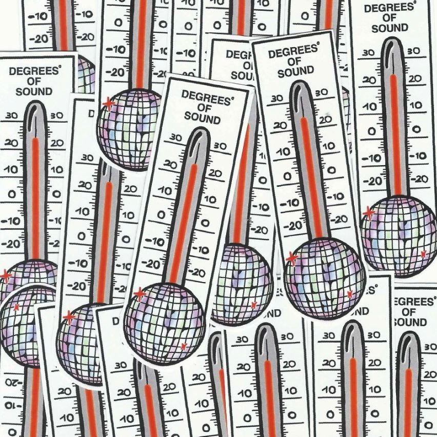
Solution: Taking advantage of the city’s wide temperature amplitude, a thermoter-based symbol was used to be matched by the current temperature of the city over promotional campaigns. Using a disco ball at the bottom as an indicator of warmth inside the group’s events.
MUNDI SURFSHOP
The surfshop expansion of the acclaimed Curitiba skateshop.
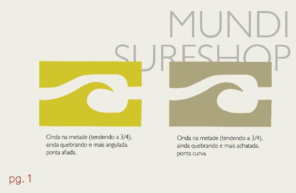
Challenge: Utilize this as an opportunity of standardization of elements inside the Mundi Umbrella as well as bringing something fresh to the south brazilian scene that communicated well with the simplicity of the skateshop logo.
“aggressiveness”
“competitiveness”


“receptiveness”

Solution: Creating a symbol that embraced the company’s values of receptiviness as well as competition and aggresiveness used through the wave, being a factor of respect for surfers of all ages and technical levels. Retaining the skeleton of the skateshop logo while adding a meta refference of the wave crashing with the skate ramp as a shout out to the expansion.

EXCLUSIVE SOULS
Fashion and Hip-Hop brand from Toronto
Challenge: Englobe the client’s need for sophistication along with a Gen-Z language, promoting something unique and recognizable.


Solution: Using cursive writing to create a logo and a easily recognizable symbol that could be used in various multimedia efforts. Aspects like the heart and the emoji directly relate to the experience of being a twenty something year old in Canada as well as symbols widely recognized in hip-hop.
Instructional zine and promo for Good Time Skateshop


